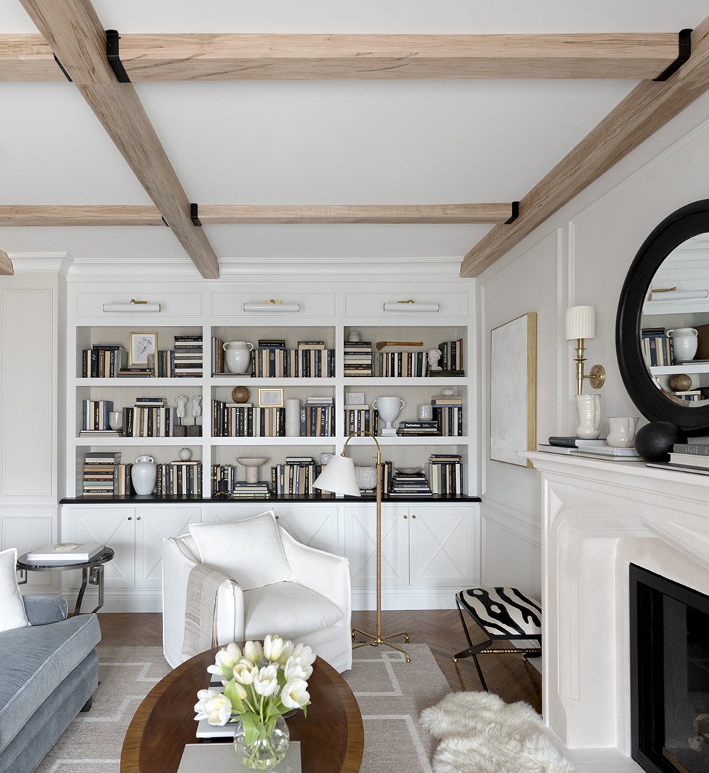
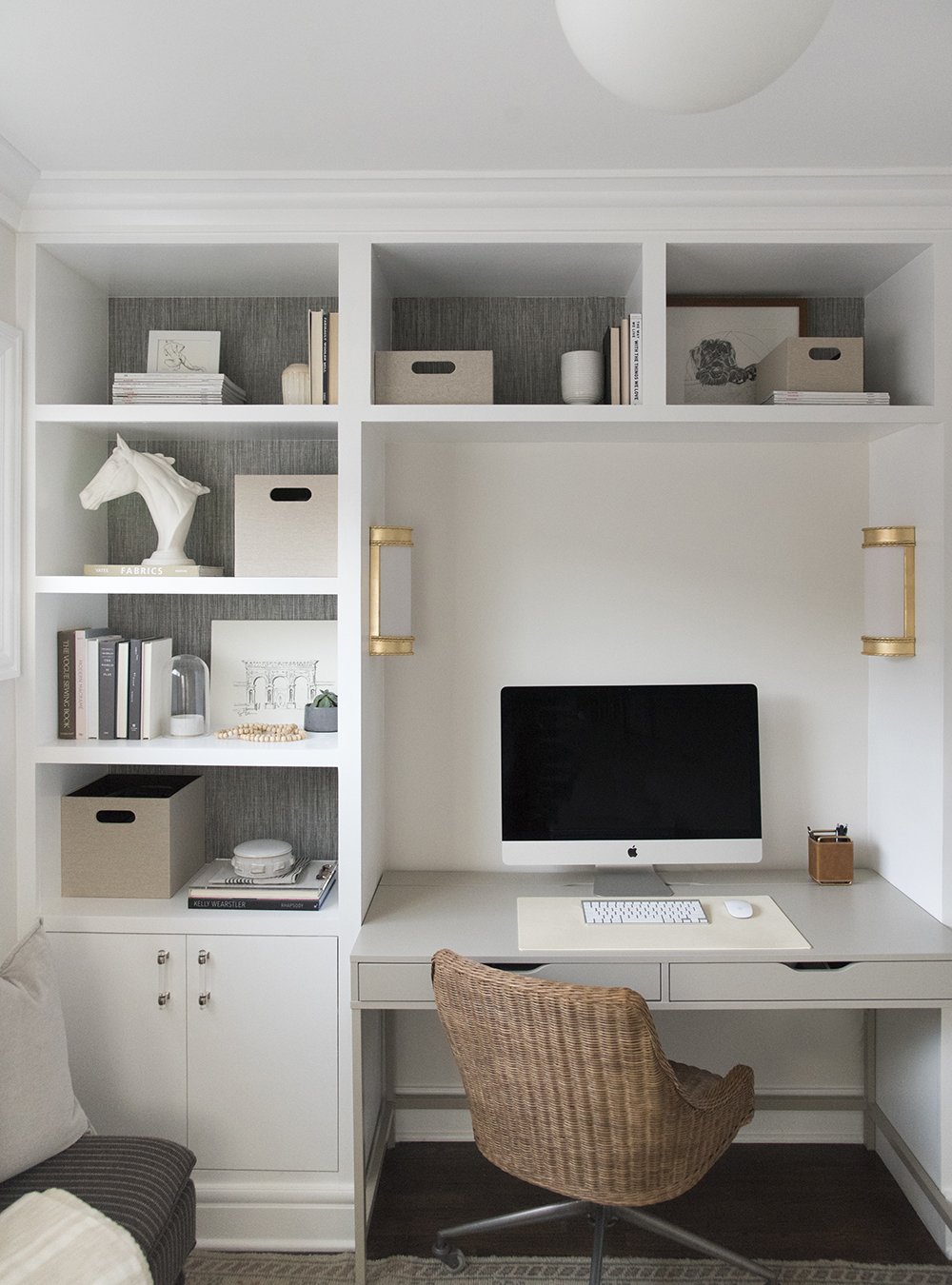
Design Series Feature: Renew Home Staging & Design
I’ve always appreciated a beautifully styled home.
Even as a kid, I remember my own “oohs” and “ahhs” when I’d walk through a model home - always wishing I had the kid’s room styled with the minimal but sophisticated decor.
Now (a few decades later) I’ve come to the conclusion that those elegantly staged homes impressed me at 10 and continue to impress me now because interiors make all the difference in a home.
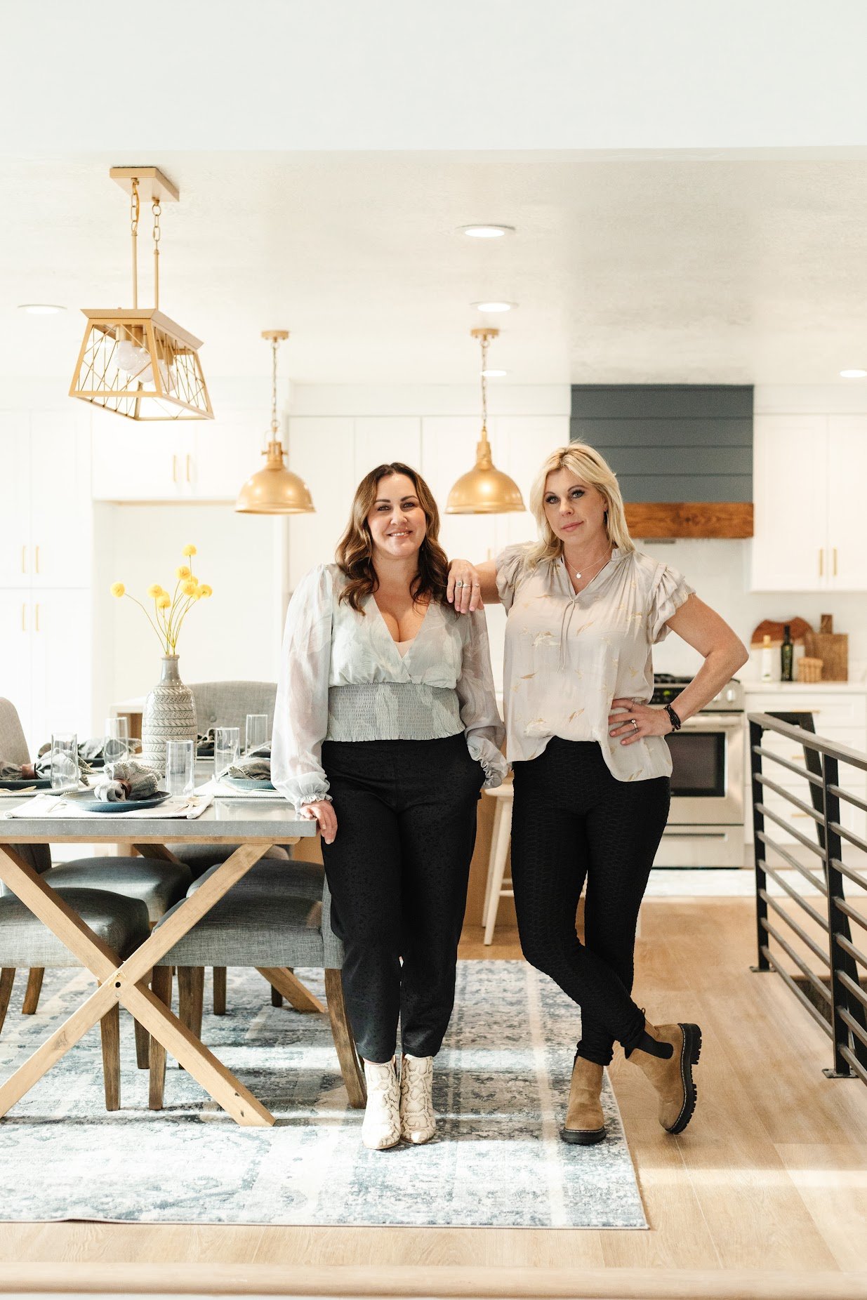
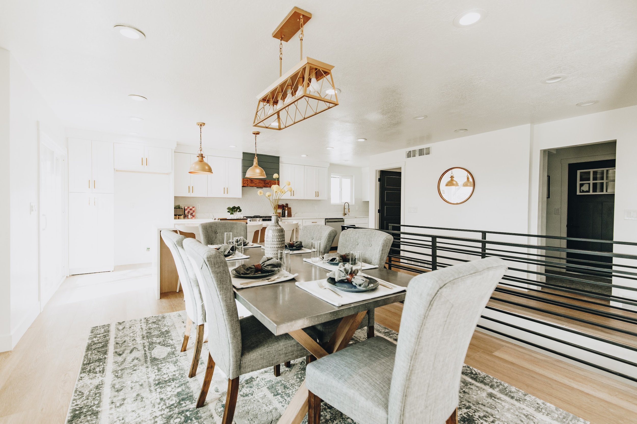
This month I am so excited to feature Harmony Young and Laneè Miller of Renew Home Staging & Design. Harmony and Laneè bring both interior design chops and an in-depth knowledge of real estate to their work. They created a growing company in Utah with a team that helps homes sell faster and for more. I had the pleasure of meeting them via social media last year and have been so amazed by their business and eye for styling. I am so excited to share their insight with you this month.
Q: Is there anything unique about the Utah home market right now from your perspective?
L: Not completely unique because other areas are growing as well, but it is very obviously a sellers market that’s going up rapidly.
H: Something interesting is that I did a consultation yesterday in a $400,000 home and then another consultation for a $4M home. Every price point is selling and going for top dollar, and every home sells better with staging.
Q: What’s one mistake you see homeowners making before they list their homes from a design perspective? Any tips to avoid it?
L: The biggest mistakes people make are underestimating the large impact that small design changes can make. You don’t have to flip your entire home for it to be completely transformed.
H: They clear out too much so that there’s not appeal or warmth because it’s so empty. Or they end up spending too much money on repairs that might not make a big impression.
Q: What advice would you give to someone who wants to update their space?
L: Check with a professional first for what’s going to make the biggest difference so you don’t spend unnecessary time or money on something that won’t have that big of an impact. For example, you might not need to completely replace your floors and instead putting down a few cute rugs will completely transform a space! It can truly save you thousands of dollars.
H: Start with paint! Because it’s cheap and easy. And then try to incorporate your existing pieces, but add in some new pieces to give it a refresh and update. Rugs also can be inexpensive and transform a room.
Q: What are your thoughts on home organization and interior design?
L: I think that in order for people to feel good in their space and get the most out of their space, design and organization is the only way to really do that. Our homes are where most of us spend the majority of our lives, and so why not put our effort into it and feel good about it?
H: Hire a professional. If you know you’re not amazing at it, spend your money on a professional because you’ll get the most for your money. Home organization and interior design are such an important duo because it creates a beautiful AND functional space.
Thank you for sharing your words of wisdom with us, Harmony and Laneè. You can learn more about Renew Home Staging & Design on their website, here. You can also find them on Instagram, here.
RELATED POST: Design Series Feature: SPACES Collective
Design Series Feature: Elyse Garlock Home
I’m always inspired by what interior designers can do to a space. While I think in terms of how a space is organized, an interior designer is so easily able to balance things like color and texture all while creating a beautiful scene out of furniture and form.
This month, I am so happy to feature Elyse Garlock of Elyse Garlock Home. I had heard how amazing Elyse was from mutual friends that she and I had in common but didn’t end up meeting her in-person until years later when we both relocated from California to Utah.
Once we connected, I just knew I wanted to interview her and have her share some of her design insights with you in this month’s Design Series Feature.
Q: How do you go about planning out a new space?
A: I usually sit down with the client (or myself) and talk through a few things—1) the purpose/main use of the space (want it pretty but also practical); 2) what their general design style is—simple, modern, traditional—I usually have them send me a few inspiration pictures so I can really get a sense of what they’re picturing in their head for the space; 3) and their realistic budget.
Q: What budget-conscious tips do you have for someone who wants to redo a space in their home? Where should they look for ideas and pieces?
A: I usually tell people to invest in nicer large items that will hold up well and that they can have for a long time - think area rugs, couches, kitchen table, etc. I think a lot of people - especially those with kids - will just get something cheap because they figure it will get trashed anyway. Well, cheap items usually do get trashed pretty quickly, and then they just don’t look nice! And no one wants that. Instead, purchase large items that are good quality and will be able to withstand the wear and tear. Solid wood, performance fabrics, etc. These will usually cost more up front, but will last longer, look nicer, and clean up easier. Other items that are easily influenced by ever-changing design trends are great places to save money. This could include decor to fill shelves & built-ins, throw pillows, art work, etc. For things like this, I turn to places like Target, Amazon, H&M home, Zara Home, IKEA, and Heirloom Art Co (for art prints). Bringing in natural elements like wood tones and greenery can also make your space feel more refined without costing a lot.
Q: How do you feel about the relationship between home organization and home design?
A: For me, home organization and home design are completely intertwined. I value simplicity and clean lines in my design, and that is impossible to achieve when things are cluttered and disorganized. Designing is all about how the space is going to make you feel - for me I’m looking to feel peaceful and content - and a huge part of that feeling comes from knowing that everything has its place and that I know where to find the things I need. When I can see all the messes in my house, it adds so much to my anxiety. I wish I were better at keeping things organized - it’s definitely a constant battle!
Q: Design isn't the only thing you're an expert about - can you share more about Dualspace?
A: Dualspace is a company my husband and I started in 2018. It is essentially a marketplace of locations - homes and studios - that are available to rent for photo and video shoots. It wasn’t something we ever really intended to do. In 2017, the company my husband was working for needed a house for a product shoot (my husband was on the marketing team), and he volunteered our house as a last minute replacement. It went well and was a super easy way to make money. After that, some of the people on the video team asked for other location recommendations for other shoots, and we reached out to some friends and neighbors who had cool homes to see if they’d be interested. It just kind of snowballed from there. We found there wasn’t really a great option for finding locations, other than these sites with thousands of homes that were all over the place style/design wise. We thought it would be helpful for crews to have a smaller, more curated collection to choose from. And, it would also be helpful to those homeowners wanting to host shoots to have a platform to get greater exposure… I find that brands are looking for a couple different types of homes when they do shoots. One preference is for spaces that are light and bright, free of clutter, and that are neutral enough to change decor as needed to match the brand. Alternatively, they sometimes are looking for a home with a very specific style - mid-century modern, tuscan, farmhouse - that is consistent throughout the space.
Thank you so much Elyse for taking the time to answer my interior design questions and for sharing your tips! Be sure to give her a follow on Instagram and you can learn more about Dualspace here.
RELATED POST: Design Series Feature: Renew Home Staging & Design
Design Series Feature: Sarah Gibson from Room for Tuesday
So much of how a home feels is directly correlated to how it is designed and styled.
Because as it turns out, good design matters.
Like a lot.
I have always had an appreciation for beautiful interior design and as a home organizer I’m a firm believer that thoughtful interiors matter. Interior design sets a tone and a mood for the day-to-day of all those who are surrounded by it. It’s powerful and beautiful.
This month I am so excited to get to share my interview with Sarah Gibson - the creative director, designer and founder behind Room for Tuesday and owner of the shop, Tuesday Made.
When I first saw Sarah’s work, I had to stop and stare. Her eye for detail and her thoughtful approach to the various elements that make a house a home are just a few of the things that have made her projects so memorable for me.
What I love about Sarah’s approach to designing and styling is that her designs are timeless and oh so sophisticated. It’s the kind of sophistication that makes you want to sit in one of her spaces and soak in all the details that she has so intentionally placed.
Q: You're no stranger to home renovations - how do you approach your new projects? Do you set mood boards? Or do you follow your innate interior design mind and go for it?
A: While I no longer design for clients, I treat our projects at home much like I would a client project. I love planning, getting organized, and completing the entire design before demolition even begins. That includes floor planning, elevations, moodboards, selecting finishes, gathering samples, and ordering the bulk of the items that will exist in a space. I like having a set plan! The design and styling portions of the process are always my favorite- so the beginning and the end. It's fun to watch something you envisioned in your mind come to fruition and become reality.
Q: How would you describe your style and do you think it has evolved over time?
A: I believe our personal aesthetic and style is ever-changing and evolving as we grow. I'd like to think it's shaped by our experiences and as we age, we become more capable of determining what feels and looks like us. My personal style has definitely changed over the years. I started my blog at such a young age - it has really proved to be great documentation of my growth and evolution, in regards to aesthetics. I also believe the style or architecture of your home comes into play when it comes to design... I always take that into consideration, because not only do I want my home to reflect my personal aesthetic, but I also want it to feel cohesive to the architecture of the house itself. It's so tricky to nail down a specific style because I enjoy curating and blending multiple aesthetics and design styles. I love classic and traditional design, as well as curating vintage and more eclectic or modern pieces. It's always a mixed bag in my house, but I always try to keep timeless design in mind... if I bring something into my home, I want to make sure I'll still love it in a year, five years or even ten years.
Q: How do you feel about the relationship between home organization and home design?
A: I think organization and home design is very correlated. I always consider function and organization when designing rooms or renovations. It's especially important in small or high-functioning spaces! When designing our kitchen, I thought about how each cabinet would be used, what the interior of that cabinet would look like, how it would be organized, and designed accordingly. Having a clean and organized home is important to me - it enhances my happiness and productivity, so it's something I always consider when designing a space. I try to use every square foot in a smart and thoughtful way.
Q: What do you love about Salt Lake? Any favorite places that inspire you?
A: I'm a Salt Lake City transplant (I've lived here 6 years now), and the beautiful mountains are what brought my husband, Emmett, and myself to Utah. We love adventure and the outdoors, and this is the perfect place for that. On weekends, you can find us skiing, camping, paddling, on a trail, etc. The mountains are always a creative and inspiring escape for me. We feel very lucky to live close to so many beautiful spots, trailheads, and incredible (and varied) landscapes.
Q: What is your advice to someone looking to update their existing home? Where should they start?
A: I always start with a list... I jot down wants, needs, the budget, and try to figure out how to accomplish those things. It's always easiest to set parameters first (the budget, the amount of space you have to work with, etc), then think creatively about how to achieve a beautiful and functional space, when it comes to design. Whether that path includes getting quotes and hiring contractors or taking the DIY route, it's always best to have a solid plan before the project even begins. That's especially important now that lead-times have been extended thanks to supply chain issues and backorders!
If you’ve ever needed major interior design inspiration then be sure to check out Room for Tuesday and Sarah’s shop, Tuesday Made.
Thanks again Sarah for all of your tips and insight into how you make a house a home. So looking forward to your upcoming projects!
Are you looking for a little (or a lot) of help with your own home organization? Click here and schedule a complimentary 15-minute consult and chat with me about your home organization goals or follow me on Instagram here for daily organization and minimalist-living tips.
RELATED POST: Design Series Feature: Elyse Garlock Home
Design Series Feature: SPACES Collective
If I’ve learned anything from my own home renovation (and by working in the homes of others) it’s that good design is timeless. And beautiful styling literally changes everything about a space.
A little more than one year ago while perusing Instagram, I found SPACES Collective, a boutique property styling agency based in Toronto. I remember landing on their feed and instantly swooning over their modern and minimalist approach to style. Every project they shared (and continue to share) was something I wanted to save, Pin and send to my husband to help spark ideas for our own house.
This month, I am so excited to get to share my interview with Natalie Balen-Cinelli + Julia Salerno - the two women behind SPACES Collective.
I have loved getting to know them this past year as I’ve asked them questions about everything from where to find the best faux plants (which they helped me find and I love) to their overall approach to styling modern properties.
So without further adieu, please enjoy this month’s Design Series Feature with Natalie and Julia of SPACES Collective.
Photo credit: SPACES Collective
Q: How do you approach a new space? Where does the styling begin for you?
A: It really depends on the type of project. We stage both occupied and vacant spaces which offer different levels of flexibility in our styling. Often, when working with a client's existing furniture, we try to neutralize the space as much as possible. We bring in new rugs, lamps, greenery, pillows and decor that help finish off a space and that make a big impact. For a condo or model suite, we often start with a floor plan followed by a site visit to ensure the pieces we select are the right size and fit. There is never a one-size-fits all approach as every space is different, but typically with staging, our priority is to ensure the spaces we style always showcase the property to its highest potential. To do this, we like to view the space as a potential buyer would: what are the key features of the home, how will the new buyers' use the space and what is the best layout for each room? The last piece of that puzzle is to identify with the realtor who our key demographic is. For example, if a condo is located in the financial district of a downtown core, it would be completely amiss to stage a bedroom as a nursery. The design of the space must speak to all potential buyers in order to cast the widest net possible and appeal to the most amount of people. First impressions are key in this business as well as sight lines and how the space will appear in photos and all factor in to how we style a space for sale.
Q: What advice would you give to someone who wants to give their existing living room a refresh?
A: The most impactful way to refresh a space is to change out accessories. Rugs make a big difference in a space and can really set the tone. We always recommend purchasing neutral foundation pieces so that if you want to introduce colour to a space, you're not breaking the bank to replace them if you get tired of it. Swapping out a rug, for example, can really transform a space. We love to use ones with lots of texture and ones that are made from natural fibers. Art is another way to make an impactful refresh to a space. And when it comes to accessorizing, we like to layer in different size objects, candles, books and plants.
Q: Do you have any styling advice for newbies who are planning to DIY their space and don't have a styling eye? Specifically, anything they should avoid?
A: The best advice is that there are no rules -- you don't need to match your pillows to your curtains and your rug -- so find pieces you love and build on those. Neutrals are always in style and give you the opportunity to introduce colour selectively. Gone are the days of "themed" spaces. Just because you love turquoise, doesnt' mean it should appear on an accent chair, on pillows and in your art. If you want to use your favourite colour in your space, consider finding a great abstract piece with the colour dotted in so that it's not the main focal. Keep all other items in the space neutral and layer in natural elements like wool throws, woven rugs, black and white cozy pillows and wood decor pieces.
Q: What are your thoughts on home organization? Do you find it helps a home sell when it's decluttered and styled?
A: Absolutely! You can't have one without the other. Decluttering and organizing are the first steps when preparing your home for sale. You can style a house beautifully all you want, but if it's not decluttered you don't get that "ahhhhh" feeling when you walk in. A clean and well organized home lets potential buyers know that it has been well-kept and maintained. And well-organized closets can give the illusion of more space. We always recommend reducing closet capacity by at least 45% by removing non-seasonal items and keeping only what's absolutely neccessary for the duration of the sale. Potential buyers want to know your home's closets have enough room in them to store their things, so they'll always take a peek inside.
Q: What is your advice to someone thinking about hiring a staging service prior to moving?
A: There's no such thing as too early! You can get a head start with a consult, where a stager will give you tips on what and how to declutter, what items needs to move out to storage or be donated, what paint colours to use and offer advice on small-scale or light renos and repairs that will be most impactful when selling (bathrooms and kitchens are biggies). We also like to recommend replacing out-dated light fixtures. Most of our client's would attest that the majority of work begins before the staging install. Depending on how much work needs to be done to your home, plan for at least 4-6 weeks in advance.
Q: I know that you're based in Toronto but do you ever do any virtual interior styling work? Anything outside of Canada?
A: We haven't! We've had such a crazy year and a half that we've had no time for any design or virtual work.
Be sure and check out the SPACES Collective feed if you haven’t already given them a follow. Their eye for balance and beauty is spot on and their attention to detail is no doubt how they are helping homes in the Toronto area sell fast.
Thanks again Natalie and Julia for all of your tips and insight into what you both do so well. Can’t wait to see more from your upcoming projects!
RELATED POST: Design Series Feature: Room For Tuesday

